


Interviews
News Flash
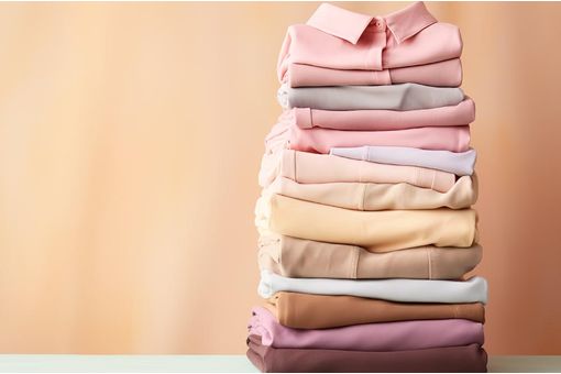
Pantone unveils Pantone Spring '14 fashion color report
12 Sep '13
4 min read
Pantone LLC, an X-Rite company and the global authority on color and provider of professional color standards for the design industries, unveiled the PANTONE Fashion Color Report Spring 2014, a comprehensive overview of designers’ use of color in their upcoming collections.
Released to coincide with New York Fashion Week, the PANTONE Fashion Color Report features the top 10 colors for women’s and men’s fashion for spring 2014, along with designer sketches, quotes and headshots
“This season, consumers are looking for a state of thoughtful, emotional and artistic equilibrium,” said Leatrice Eiseman, executive director of the Pantone Color Institute. “While this need for stability is reflected in the composition of the palette, the inherent versatility of the individual colors allows for experimentation with new looks and color combinations.”
The top colors for women’s fashion for spring 2014 are:
-PANTONE 15-3920 Placid Blue
-PANTONE 16-3823 Violet Tulip
-PANTONE 15-6114 Hemlock
-PANTONE 16-0000 Paloma
-PANTONE 15-1225 Sand
-PANTONE 14-0852 Freesia
-PANTONE 18-1651 Cayenne
-PANTONE 17-1360 Celosia Orange
-PANTONE 18-3224 Radiant Orchid
-PANTONE 18-3949 Dazzling Blue
The top colors for men’s fashion for spring 2014 are:
-PANTONE 15-3920 Placid Blue
-PANTONE 18-3718 Purple HazePANTONE 18-6216 Comfrey
-PANTONE 16-0000 Paloma
-PANTONE 15-1225 Sand
-PANTONE 14-0852 Freesia
-PANTONE 18-1651 Cayenne
-PANTONE 17-1360 Celosia Orange
-PANTONE 19-2428 Magenta Purple
-PANTONE 18-3949 Dazzling Blue
Women’s Color Palette
Designers take a modern twist on the traditional for spring 2014 by pairing soft pastels with vivid brights to create a colorful equilibrium. Inspired by a mixture of blooming flowers, travels abroad, and strong, confident women, designers use color to refresh, revive and defy conventional wisdom.
Three very adaptable pastels sit on one end of the palette, and, because we are so accustomed to seeing them as nature’s background, they can be creatively combined with any other color in the spectrum.
Placid Blue, like a pictureperfect, tranquil and reassuring sky, induces a sense of peaceful calmness, while Violet Tulip, a romantic, vintage purple, evokes wistful nostalgia. Similar to the verdant shade of springtime foliage, Hemlock, a summery, ornamental green, provides a decorative touch that’s very different from the greens of recent seasons. Pair any of these versatile pastels with a bolder hue for an au courant look.
Sand, a lightly toasted and amiable neutral, conjures images of the beach and the carefree days of summer. Try pairing Sand with Hemlock for perfect, natural balance. Paloma serves as a quintessential neutral, interesting enough to be worn alone or combined with any color for sophisticated poise.
Popular News
Leave your Comments
Editor’s Pick

Jason Kent
British Textile Machinery Association (BTMA)

C Devarajan & P Raajashekar
Texvalley


Dr. Klaus Schaefer & Matthias Schmitz
BB Engineering


Sirinada Preechawitayakul
Brand - Senada


Esteemed Clients


-Ltd..jpg?tr=w-120,h-60,c-at_max,cm-pad_resize,bg-ffffff "Thermore (Far East) Ltd.")


.jpg?tr=w-120,h-60,c-at_max,cm-pad_resize,bg-ffffff "Telangana State Industrial Infrastructure Corporation Limited (TSllC Ltd)")
.jpg?tr=w-120,h-60,c-at_max,cm-pad_resize,bg-ffffff "Taiwan Textile Federation (TTF)")