Global colour authority Pantone names Very Peri as colour of year 2022
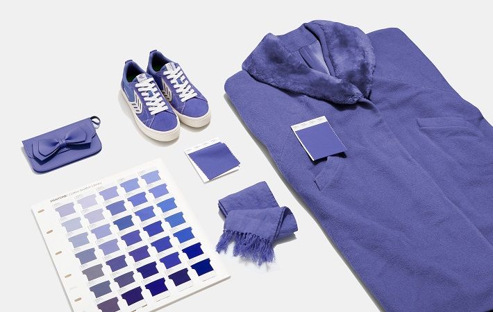
“Displaying a carefree confidence and a daring curiosity that animates our creative spirit, inquisitive and intriguing Pantone 17-3938 Very Peri helps us to embrace this altered landscape of possibilities, opening us up to a new vision as we rewrite our lives. Rekindling gratitude for some of the qualities that blue represents complemented by a new perspective that resonates today, Pantone 17-3938 Very Peri places the future ahead in a new light,” Pantone said in a press release.
Pantone 17-3938 Very Peri is a symbol of the global zeitgeist of the moment and the transition the world is going through. With trends in gaming, the expanding popularity of the metaverse and rising artistic community in the digital space Pantone 17-3938 Very Peri illustrates the fusion of modern life and how colour trends in the digital world are being manifested in the physical world and vice versa.
“As we move into a world of unprecedented change, the selection of Pantone 17-3938 Very Peri brings a novel perspective and vision of the trusted and beloved blue colour family,” said Leatrice Eiseman, executive director, Pantone Color Institute. “Encompassing the qualities of the blues, yet at the same time possessing a violet-red undertone, Pantone 17-3938 Very Peri displays a spritely, joyous attitude and dynamic presence that encourages courageous creativity and imaginative expression.”
“Creating a new colour for the first time in the history of our Pantone Color of the Year educational colour programme reflects the global innovation and transformation taking place. As society continues to recognize colour as a critical form of communication and as a way to express and affect ideas and emotions and engage and connect, the complexity of this new red-violet-infused blue hue highlights the expansive possibilities that lie before us,” said Laurie Pressman, vice president of the Pantone Color Institute.
Pantone 17-3938 Very Peri, a warm and friendly blue hue with a carefree confidence and joyful attitude, emboldens uninhibited expression and experimentation. Displaying a dynamic presence, Very Peri is an enthusiastic blue hue whose whimsicality lends itself to unpredictable colour harmonies and spontaneous colour statements. Futuristic in feeling, Very Peri takes on distinct appearances through application to different materials, finishes and textures, from shimmery metallics, lustrous sheens and high-tech materials to handcrafted looks and natural fibres, the release added.
Very Peri will be added into the Pantone Fashion, Home + Interiors Color System, the most widely used and recognised colour standards system for fashion, textile, home and interior design.
* PANTONE Colors displayed here may not match PANTONE-identified standards. Consult current PANTONE Color Publications for accurate color.
Fibre2Fashion News Desk (KD)









-Ltd..jpg?tr=w-120,h-60,c-at_max,cm-pad_resize,bg-ffffff)


.jpg?tr=w-120,h-60,c-at_max,cm-pad_resize,bg-ffffff)
.jpg?tr=w-120,h-60,c-at_max,cm-pad_resize,bg-ffffff)


