


Interviews
News Flash
Monte Carlo revamps logo for global identity
01 Jun '18
2 min read

Courtesy: Monte Carlo
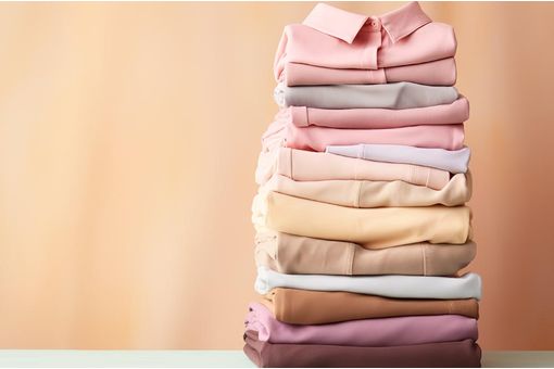
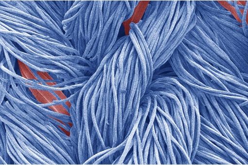
Leading apparel brand Monte Carlo has come up with a new logo which is bolder, trendier and signifies the ethos of the company better. The company will feature the new logo in all its communication henceforth, including the television commercials and outdoor advertising. The brand has however retained its tagline —It’s the way you make me feel.
In the new logo, the blue background and red rectangle enclosing the text has been done away with. The tagline has also come closer to the brand name 'Monte Carlo', which has been given a new typography style. The triangle with letters 'mc' has been retained, and given a dynamic appeal in order to connect with the fashion conscious populace and exhibit a contemporary and modern expression, a Monte Carlo press release said.
"We have decided to change the logo after a lot of planning. We wanted to design it in line with the changing times and with the change in patterns of our garments which reflects an international vibe. A lot of thought and diligence has gone into the new logo. The new logo is stylish and really speaks for itself, and of the quality of our garments. However, we have decided to retain the tagline which is very catchy, identifiable and in sync with what we are doing. Together with the tagline and the new logo, we will be making a far louder statement and will be able to make Monte Carlo a more preferred brand. We will initiate a complete 360 degree activity to market the garments with the new logo,” said Monica Oswal, executive director, Monte Carlo Fashions Pvt Ltd.
Monte Carlo has been really quick in bringing the latest from the international fashion circles to India and offering those patterns and styles that are in vogue globally. The company has been able to have a loyal customer base because of constant innovation and quality products. (RR)
Fibre2Fashion News Desk – India
Popular News
Leave your Comments


Esteemed Clients


-Ltd..jpg?tr=w-120,h-60,c-at_max,cm-pad_resize,bg-ffffff "Thermore (Far East) Ltd.")


.jpg?tr=w-120,h-60,c-at_max,cm-pad_resize,bg-ffffff "Telangana State Industrial Infrastructure Corporation Limited (TSllC Ltd)")
.jpg?tr=w-120,h-60,c-at_max,cm-pad_resize,bg-ffffff "Taiwan Textile Federation (TTF)")