


Interviews
News Flash
Pantone unveils Spring 2015 Fashion Color Report
06 Sep '14
5 min read
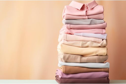
“Marsala works well with Glacier Gray, a timeless and unobtrusive gray that adds a sense of graceful relaxation as another practical neutral. Bring Marsala and Glacier Gray together with Aquamarine for an unexpected and exciting pairing that is perfect for spring.”
For the men’s color palette, Pantone says, “For spring 2015, the men’s palette takes a surprising turn, deviating from the women’s palette more than we have seen in recent seasons. The menswear colors emphasize the need for uncontrived hues, where natural tones are interspersed with deep, foundational colors for an unassuming and sophisticated Top 10.
“A perennial favorite for men, dependable Dusk Blue offers a cool, calm serenity, representative of the sky. Juxtapose it with Glacier Gray, a masculine and practical neutral, or Treetop, nature’s healthy, harmonious green for a happy marriage of adaptable cool, warm and neutral tones.
“Classic Blue remains a core anchoring hue that is powerful in tailored suits or casual sportswear, while Toasted Almond continues to serve as another essential neutral. With its yellow-green tint, Woodbine is a tropical green best described as nature’s neutral that pairs well the earthy and rugged associations of Sandstone.
“Masculine and solid, Titanium is a gray that speaks to timelessness and exudes strength, while Marsala offers a robust and rich contrast to the other colors in the palette and combines dramatically with other deep tones like Classic Blue, as well as neutral Sandstone.
“Create a charming mélange with Woodbine, Titanium and Lavender Herb, the palette’s most fashion-forward and spirited color. As purple hues continue to gain popularity in men’s fashion, Lavender Herb’s mid-tone offers a retro and almost nostalgic element to the men’s palette.”
The colors featured in the Pantone Fashion Color Report are culled from the Pantone Fashion + Home Color System; one the most widely used and recognized color standards system for fashion, textile, home and interior design.
Each season, Pantone surveys the designers of New York Fashion Week and beyond to collect feedback on prominent collection colors, color inspiration and color philosophy. This information is used to create the Pantone Fashion Color Report, which serves as a reference tool throughout the year for fashion enthusiasts, reporters and retailers
“Many feel compelled to be connected around the clock because we are afraid we’ll miss something important. There is a growing movement to step out and create ‘quiet zones’ to disconnect from technology and unwind, giving ourselves time to stop and be still,” Leatrice Eiseman informs.
She continues, “Color choices follow the same minimalistic, ‘en plein air’ theme, taking a cue from nature rather than being reinvented or mechanically manipulated. Soft, cool hues blend with subtle warm tones to create a soothing escape from the everyday hustle and bustle.” (AR)
Fibre2fashion News Desk - India
Popular News
Leave your Comments
Editor’s Pick

Therese Premler-Andersson
Textile Machinery Association of Sweden (TMAS)

Jason Kent
British Textile Machinery Association (BTMA)

Christian Guinet
French Textile Equipment Manufacturers’ Association (UCMTF)

S. Chendhuran
SP Retail Ventures Limited


Esteemed Clients


-Ltd..jpg?tr=w-120,h-60,c-at_max,cm-pad_resize,bg-ffffff "Thermore (Far East) Ltd.")


.jpg?tr=w-120,h-60,c-at_max,cm-pad_resize,bg-ffffff "Telangana State Industrial Infrastructure Corporation Limited (TSllC Ltd)")
.jpg?tr=w-120,h-60,c-at_max,cm-pad_resize,bg-ffffff "Taiwan Textile Federation (TTF)")