


Interviews
Your go-to source for news, anytime, anywhere! Insightful industry information from the textile, apparel & fashion world with our news app
Download Now
Your go-to source for news, anytime, anywhere! Insightful industry information from the textile, apparel & fashion world with our news app
Download Now
Your go-to source for news, anytime, anywhere! Insightful industry information from the textile, apparel & fashion world with our news app
Download Now
Your go-to source for news, anytime, anywhere! Insightful industry information from the textile, apparel & fashion world with our news app
Download Now
News Flash
PANTONE VIEW Colour Planner for F/W 2012/2013
15 Mar '11
4 min read
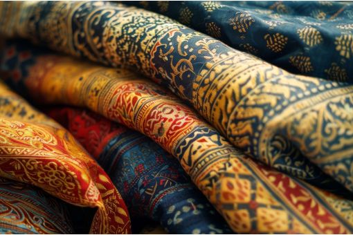
Pantone LLC, an X-Rite company and the global authority on color and provider of professional color standards for the design industries, today announced the Fall/Winter 2012/2013 edition of PANTONE VIEW Colour Planner. This multi-discipline color forecast, titled Refocus, showcases the key color palettes for women's wear, menswear, active wear, cosmetics, lifestyle and industrial, and graphic design.
PANTONE VIEW Colour Planner Fall/Winter 2012/2013 pushes individuals to refocus by encouraging a break from the “usual” or mundane into something more abstract and unexpected – often improving original intent. Exploring the different ways we feel and look at things can inform the way we innovate with color. When we see something for the first time, we impose an expectation, almost before we really look at it. The idea of looking outwards and seeing another way of being and doing holds a fascination as well as the chance to take advantage of new possibilities.
“Color is a critical factor in engaging consumers and motivating purchasing decisions. Knowing that, it is important for designers to continue to innovate and experiment with new approaches to color in their product lines,” said Laurie Pressman, vice president of fashion, home and interiors at Pantone. “The PANTONE VIEW Colour Planner forecast provides a fresh point of view with unexpected color combinations that spark the imagination, refocus attention and stimulate new thinking to capture consumers' attention.”
PANTONE VIEW Colour Planner Fall/Winter 2012/2013 contains the following eight palettes:
Lodestar – Follow your personal star!
A range of vivid and vibrant tones, which strongly stimulate your optic nerve and allow you to “see” the world.
Composed – Something new comes out of the shadows!
A series of color crescendos from muted warm or cool browns to foggy grayed greens, as well as turquoise and khaki, finishing with a dark coda of chocolate and graphite.
Submerge – The world turned upside down!
A scale of oxygenated and salty blues descends to blackened ink, stone and moss. An underwater garden beneath an underwater sky.
Radiate – Break the rules! Use the force of aesthetics!
Radiate is pure happiness and very colorful. Do not be scared by shades of bright reds, embarrassing violets and vulgar oranges. Be brave and mix them all together.
Touchstone – Take pleasure in things that are old and loved!
Traditional colors take the limelight: brown-black, mahogany, sandalwood, saddle, mid and dark tan, midnight, glossy navy – balanced by a trusty neutral.
Aperture – New ways of perceiving the universe!
A range, which includes the luminous and the somber, hot and cold, a centrifugal force and a centripetal force, the macro and the micro, the atom and the universe.
Converge – Reconnect to your natural power!
Converge is about deep, informed colors gathered together at a central point and then merged in a new, creative way.
Popular News
Leave your Comments
Editor’s Pick


Dr. Michael Duetsch & Man Woo Lee
UPM Biochemicals and Dongsung Chemical

Therese Premler-Andersson
Textile Machinery Association of Sweden (TMAS)


Durga Prasad Chalavadi
Sai Silks Kalamandir Ltd


Esteemed Clients


-Ltd..jpg?tr=w-120,h-60,c-at_max,cm-pad_resize,bg-ffffff "Thermore (Far East) Ltd.")


.jpg?tr=w-120,h-60,c-at_max,cm-pad_resize,bg-ffffff "Telangana State Industrial Infrastructure Corporation Limited (TSllC Ltd)")
.jpg?tr=w-120,h-60,c-at_max,cm-pad_resize,bg-ffffff "Taiwan Textile Federation (TTF)")